UX / UI Design Data Analytics User Research
Enhancing Service Catalog for Salesforce
A One-Stop HR Web App for Employee Hardware, Software, and More
INFO
"Service Catalog makes it easier for employees to request all the things they need as quickly as possible."
Services
Platform
During my time at Salesforce, I had the opportunity to contribute to the enhancement of Service Catalog, an internal self-service HR application. Service Catalog is a one-stop-shop that allows employees to easily request hardware, software, and various other workplace services. After working on initial feature enhancements for Work.com, I was assigned to improve the usability and design of the Service Catalog, particularly to make the platform more intuitive and efficient for employees. Working under the direction of the VP of UX, I was the sole designer on a cross-functional squad, collaborating closely with product managers, engineers, and other stakeholders to refine user flows and add strategic features to the application.
Project Role: UX Product Designer
Project Goal: To redesign and optimize the investor experience by addressing usability issues and increasing engagement with Vanguard’s digital platforms.
The Challenge
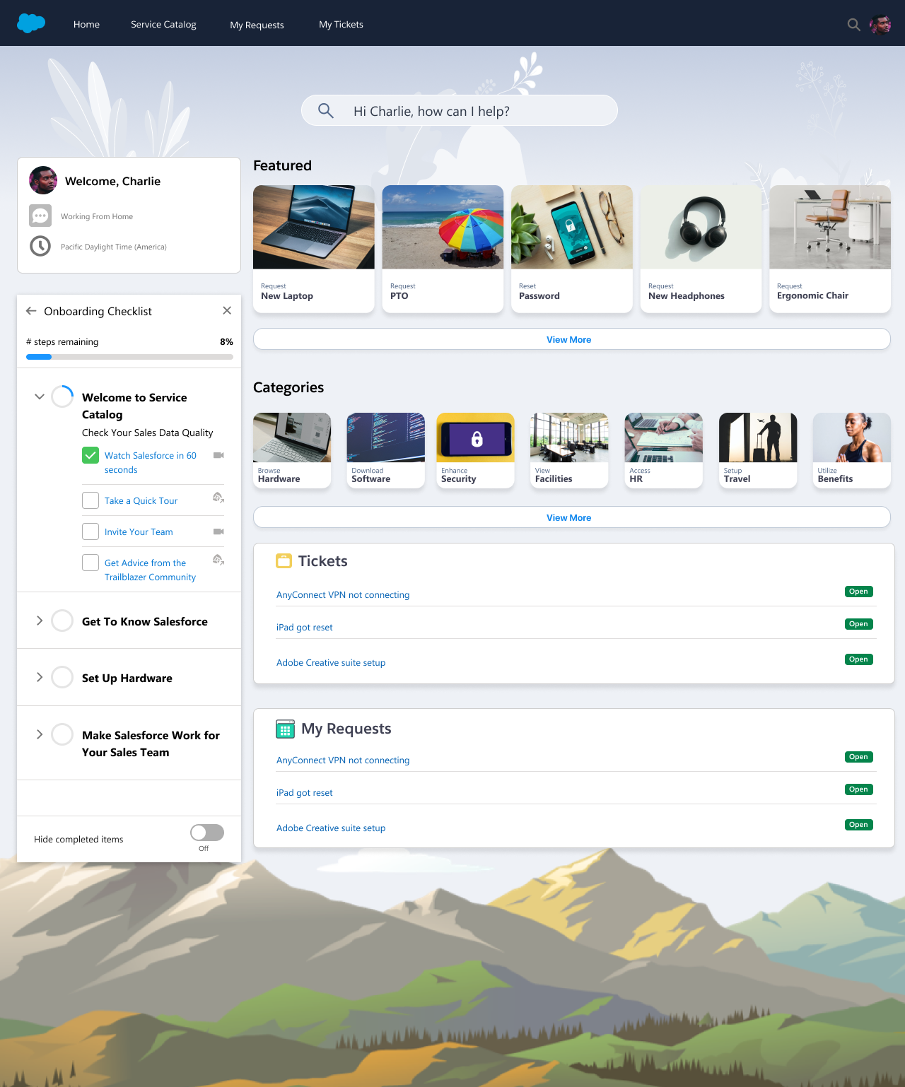
The primary challenge I faced was to improve the user experience for the Service Catalog application by addressing inefficiencies in the existing workflows and adding new features to enhance usability. The existing platform had issues with speed and clarity, particularly around how employees navigated through various request flows. The specific problem was in MVP2 (Minimum Viable Product 2), where the home screen did not provide clear guidance on the most important actions. It was unclear how to quickly access the detailed request item pages, and the lack of a strategic home screen led to inefficiencies. Additionally, the application had minimal feedback for users (e.g., empty states and toast notifications) to help them track the progress of their requests. My challenge was to design a solution that would: * Streamline the user flows, making it faster for employees to create ticketed requests. * Add a strategic home screen that would provide quick access to item detail pages and provide updates on request statuses, such as order confirmations and notifications. * Reduce checkout times and enhance the overall user experience.
Goal
The main goal was to increase the speed and reduce friction in the process of creating ticketed requests, ensuring that employees could quickly find, request, and track the items or services they needed. In addition, I needed to ensure that the design changes would align with broader business objectives, such as reducing request times and improving user satisfaction with the platform.
Design Process
1. Discovery and Research
To kick off the design process, I had in-depth conversations with a Senior Product Manager to understand the business objectives, current pain points, and what the team had already achieved in previous versions of the Service Catalog. This allowed me to align my design work with the broader goals of the project.
In parallel, I began collaborating with a Lead Engineer to better understand the technical constraints of the application and discuss early UI concepts. These conversations were critical for identifying potential challenges ahead of more detailed design work, such as complex integrations or back-end requirements that could impact the user interface.
2. Wireframing and Ideation
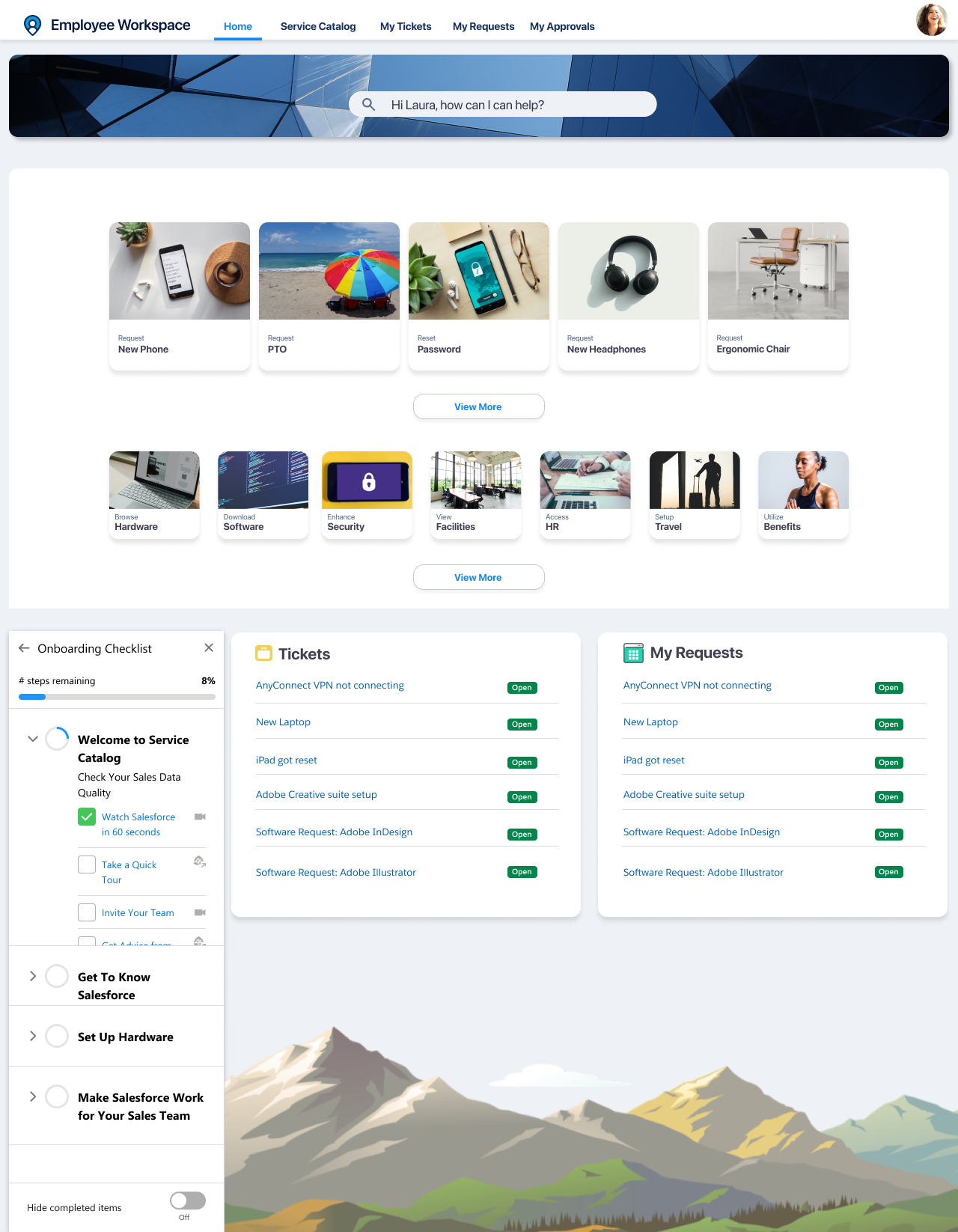
With the insights gathered from the product manager and engineer, I created low-fidelity wireframes for the new home screen and ticket creation flow. The goal was to simplify user interactions while ensuring the design could scale with future features.
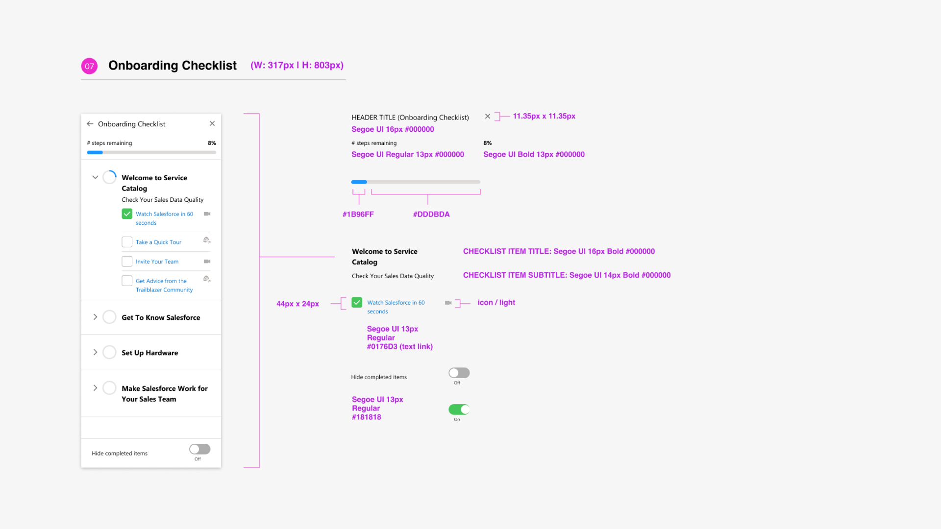
Through iterative feedback, we refined the wireframes and explored different concepts. The most debated aspect of the design was the onboarding checklist module, which was proposed to help users set up their profiles before they could browse the catalog. This module was designed to ensure that employees would have all necessary information for submitting requests, but it faced some resistance due to concerns over added friction.
3. Collaboration and Iteration
I worked closely with the product manager, engineers, and stakeholders throughout the design phase to ensure that our ideas were technically feasible and aligned with the business requirements. This iterative process resulted in 2-3 key design concepts that the team could rally behind. After testing and gathering feedback from users, we settled on a design that effectively streamlined workflows and improved navigation.
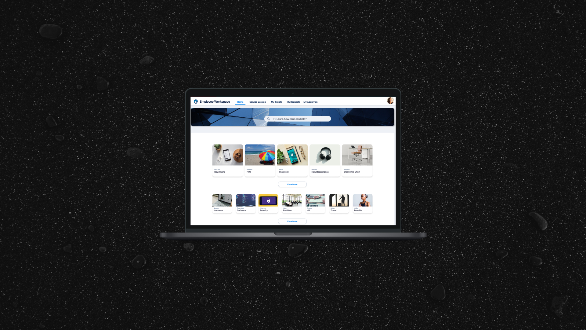
Key Design Features * Strategic Home Screen: The updated home screen provided employees with quick access to key features, including popular request items, order status, and a streamlined navigation menu for finding specific hardware or software. * Request Item Detail Pages: I added more prominent links to detailed request item pages, allowing users to get the information they needed with fewer clicks. * Improved Feedback System: To help users track their progress, I designed new empty state screens and toast notifications that provided real-time updates on the status of requests (e.g., "Request Submitted", "Item Shipped"). * Refined Onboarding Process: While initially debated, the final design included a simplified onboarding checklist that ensured employees were prepared to make requests without overwhelming them with unnecessary steps.
Results
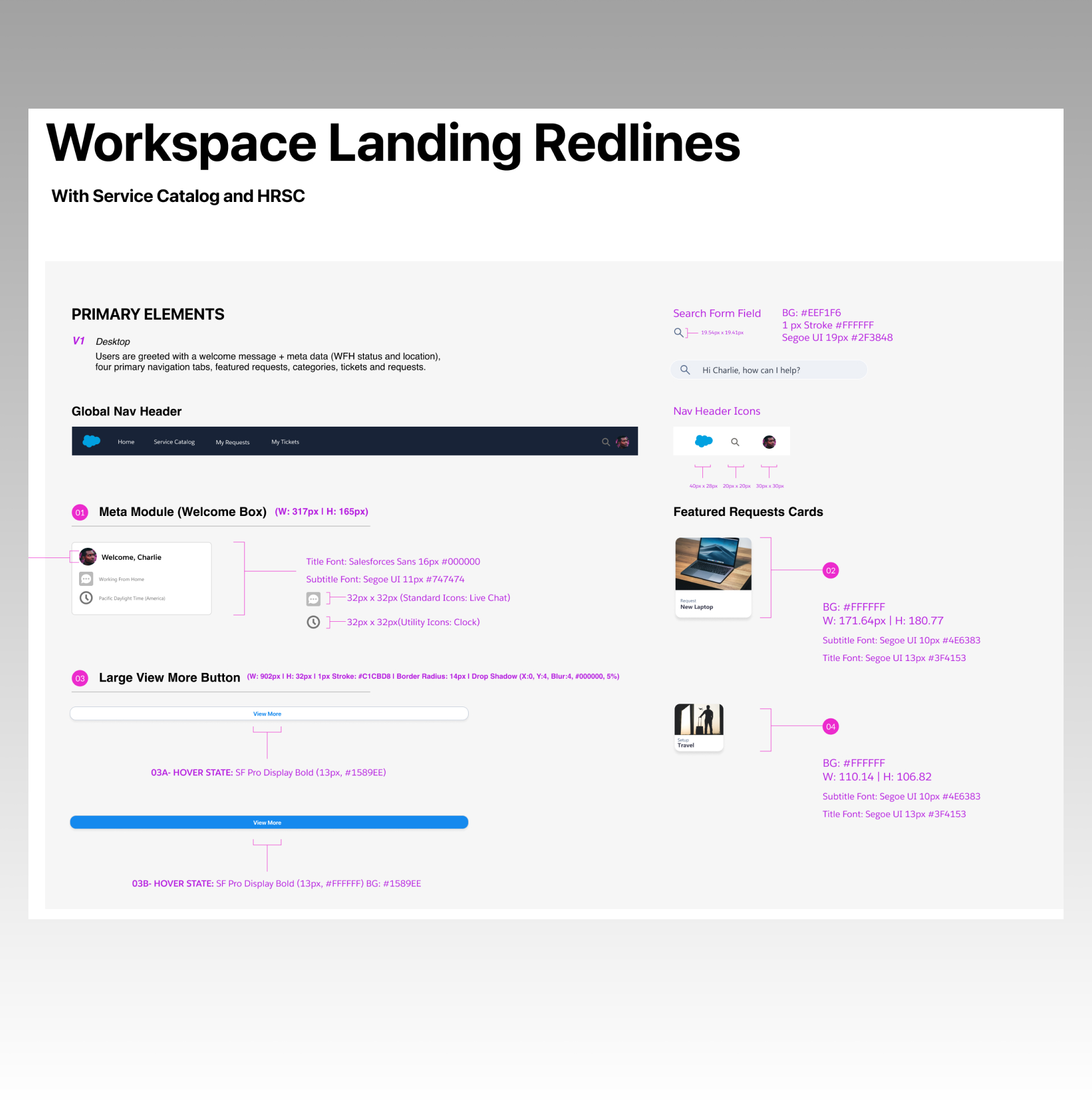
The final design was approved for development with detailed redline specifications just before my contract ended. The design successfully addressed the primary pain points identified at the beginning of the project. * Increased Efficiency: By streamlining workflows and improving navigation, employees could quickly create and track their requests with fewer steps. * Enhanced User Experience: The new home screen and feedback mechanisms improved the clarity of the interface, reducing confusion and increasing user satisfaction. * Business Impact: The improvements to the Service Catalog led to faster request fulfillment, reducing the time employees spent completing requests and increasing overall efficiency for the HR team. The consensus from stakeholders was that the redesign effectively refreshed the most important aspects of the interface, making it easier for employees to engage with the platform and complete their requests.
Conclusion
This project demonstrated the importance of balancing user needs, technical constraints, and business objectives to create a functional and effective solution. Through iterative design, close collaboration, and a focus on user-centered principles, we were able to significantly improve the Service Catalog's efficiency and user experience. The end result was a more intuitive platform that empowered employees to fulfill their HR-related needs with speed and ease.
.jpg)
